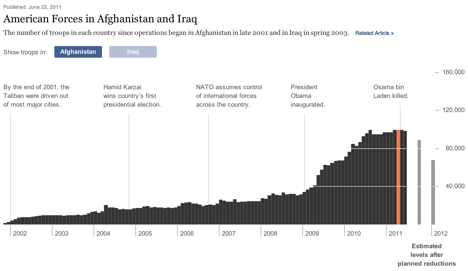
An improvement on a recent New York Times interactive graphic showing the number of American troops in Afghanistan and Iraq.
My immediate frustration with the original graphic was the inability to compare the number of troops in the two countries at a glance. In addition, there was no way to see how the combined number of troops deployed in both countries had changed over time.
Clicking on "Afghanistan" and "Iraq" at the top left switches between the two charts in an animated fashion. As only one chart is ever shown at a time, this prevents the charts from being compared visually. Clicking the buttons repeatedly and seeing how quickly the chart animates is a tedious and inaccurate way to draw comparisons between the two countries.
Likewise, the combined number of troops deployed in both countries is difficult to ascertain by switching between the two charts rapidly. It looks like the sharp drop-off in Iraq in 2010 is accompanied by an increase in Afghanistan during the same period, but it's difficult to tell if the increase and decrease were equivalent in magnitude.
While it was clear from the original chart that the number of troops deployed in Iraq was much larger than Afghanistan for the majority of the decade, we can now see exactly how much larger, without having to click anything.
We can also see exactly where the number of troops in Afghanistan started to exceed the number in Iraq.
Clicking "stack" shows us that the combined number of troops deployed in both countries dropped markedly in 2010. This was impossible to tell from the original graphic!
Don't hide your charts if you can help it! Combining charts or displaying them side-by-side allows more questions to be answered at a glance.
Thus saith Bret Victor:
The essence of data graphics is visual comparisons. This is still true for interactive graphics. Design a graphic that informs even when completely static. Then use interactivity — judiciously, powerfully, consistently — to subset the data space according to the reader's interests.
Don't make interactivity a barrier to information.
How Many Households: a similar critique and redesign of another New York Times graphic by Bret Victor.
This visualisation was written using D3 and is based on Mike Bostock’s Stacked-to-Grouped Bars example.